I asked people in my college class to look at my promotional material and offer both compliments and improvements to the work that I have created. Some of the feedback I received is listed below:
1. Website
my website can be found HERE
PRO’S
- Presentation is good
- Layout is nice
- The use of vibrant colours makes sections stand out
- Professional Looking
- Individual Tabs are good
- Links to other media
CONS
- Logos on client page could be changed to clients you have worked with
- You could add more to your contact page
- Your client page could be more eye catching
- You could use a more neutral colour blue on the homepage because it stands out a little bit too much
- spelling mistake on ‘The Independent’ on clients page
The feedback noted above was submitted by people in my college class. This feedback is really helpful and shows me what a lot of people thought was good about my website and what people thought could be improved. One of the main things that a lot of people said needed to be improved was the colour of the blue boxes on the home page. Many people said that the colour was very bold and as the rest of the webpage was very muted in terms of colour, they suggested I change the tone of the blue slightly. I decided to use all these feedback notes as targets and the improvements I have made are below:
1.
Here you can see I have met three of the feedback notes from above. The first one was that the logos at the top of the client page could be changed to companies that I have worked with. I met this feedback by adding logo’s from some of the brands listed in the boxes below. I can definitely see how this has improved my website as it looks a lot more professional with known brands. I have also met the target of ‘Your client page could be more eye catching’ by adding multiple blue boxes on the page to make the text stand out more. I have used the blue colour to keep with the theme running through out all the pages on my website. I have also changed the spelling of ‘The Independent’ in the text box as I had spelt it wrong.
Another target was to add more to my contact page. Although I didn’t want to add any more information to my contact page as I wanted to keep it simple yet effective, however I did add more colour to the page. As you can see, I have changed the contact box to blue to keep in with the theme of my website and I have also added a box behind my address to make it stand out a lot more.
3.
After being told that I could use a more neutral colour blue on the homepage because it stands out a little bit too much, I decided to mute down the colour of the blue a little bit and I definitely agree that it looks a lot better. The blue does not stand out and it now adds to the home page rather than talking all the attention away from the rest of the page.
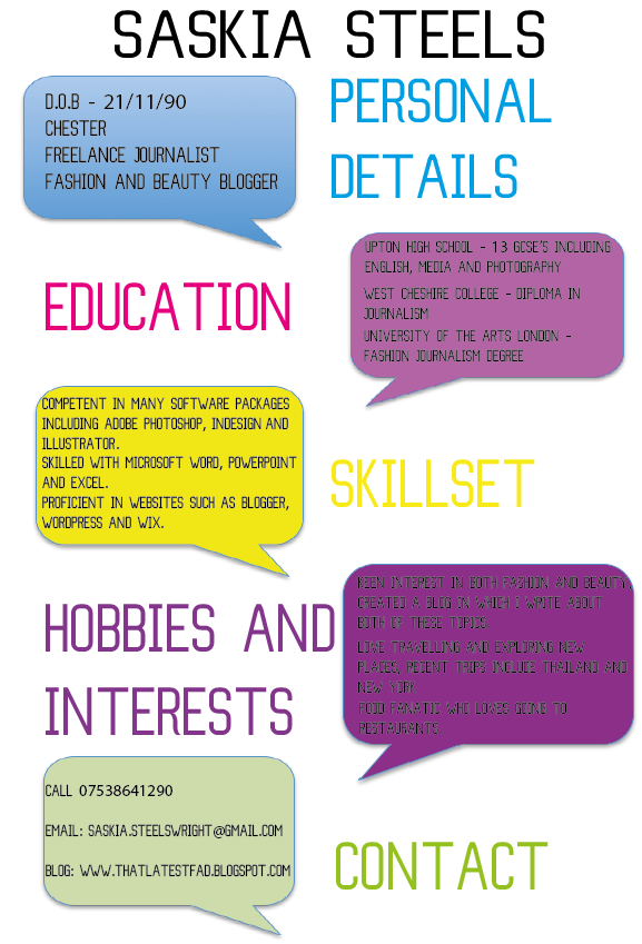
PRO’S
- Original & Contemporary
- Colourful
- Full of information
- Bold
- I like the association of the linked colours between the title and text box
CON’S
As my CV was on my webpage, people were able to give me feedback on that at the same time as my webpage and no one had any cons which I was very happy about.
PRO’S
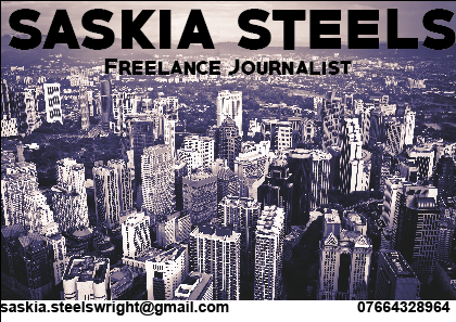
- Main photo goes very well – very urban
- Font is really nice bold
- Good placement of contact details
CON’S
- Picture is too bold
- Make contact details bigger
- Better mix of colours (make picture lighter etc)
Some of the feedback I got about my business card was very good as people have said they like the placement of my contact details and also both the font I have picked and the photo I have chosen. I decided on the very urban photo as I think it goes very well with a journalistic job as my journalism job is very city based. I did however get some criticism to my business card, such as the colours could have been chosen better and the contact details are a little bit small however I really like the way my business card looks and after taking the negatives on board, I want to keep my business card the way it is.


